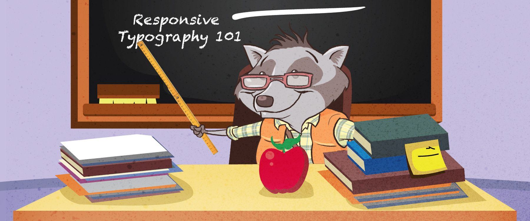
Responsive Typography an Upcoming 2017 Web Trend
Responsive typography is the natural evolution of web programming and it pairs perfectly with mobile, tablet and desktop devices.
Responsive design for websites is undoubtedly one of the web trends dominating the online marketing world going forward. Any company that is looking to survive and thrive in the new business landscape must incorporate at least the basics of responsive design into its website.
Having mobile ready sites with responsive design includes responsive typography, which many reputable sources consider to be the bulk of the actual functionality of responsive web design. Having responsive typography is therefore becoming ever more important, especially in industries that are based on technical skill.
What is Responsive Typography?
When a company incorporates responsive typography into its responsive web design, it is basically designing web copy to fit the various screen sizes that exist in different industries. Technically based industries usually have smaller screen resolutions in order to incorporate more data on the screen at once; marketing designs may incorporate larger screen resolution sizes on average in order to more precisely plan details within a campaign. Large companies can have these screen sizes all under one roof, meaning that they will likely prefer to do business with a company that can accommodate the different needs of their different departments all at once.
There are two main types of typography that can be defined as responsive: 1. the adaptive layout and 2. the liquid layout.
A. The Adaptive Layout
An adaptive layout has the ability to adjust the size of the text on screen in a limited fashion. As such it is usually the cheaper technology to incorporate into a small scale operation and is usually sufficient for companies that do not have a need for an overly large amount of functionality on a mobile device as well as desktop devices. However, the adaptive layout can be quite limiting for a company that is looking for mobile ready sites as well as full functionality on large scale computers.
B. The Liquid Layout
The liquid layout is the technology that the average person sees incorporated into the mobile ready sites of large companies. The layout is called liquid because of its constant adaptation to every possible width movement of the screen. Liquid technology is sometimes more expensive to incorporate than adaptive technology; however, it is absolutely more efficient for large scale operations or for people who use mobile typography a great deal.
How to Determine the Best Technology to Use
Whether you are changing your typography technology in house or you are working with a professional company, you must make sure that the appropriate parties know what size and type of font that you are planning on using within your web design. Designers should also know the kind of resolution that you and your customers will be dealing with in most instances. Although being able to specify size in relative terms is nice, most professionals will still want you to determine the size of the layout that you will be using by pixels, not by any of the more "advanced" methods of determining element size on a screen. One great way to measure this metric is by taking a look at your websites analytics and studying how many users you are getting per category: mobile, tablet, and desktop.
Optimal Typography
There are as many ways of determining the right method to use for typography as there are designers to create methods. Whichever method that you use, it is always advisable to check other websites that have used that same method in order to determine if it will likely work for you.
There are many free resources that are designed especially to help a web designer determine the appropriate method to use; for instance, this free typography calculator is a wonderful resource to determine the optimal mobile typography for a mobile site or even golden ratio typography for a fully responsive web design on a desktop environment.
KISS - Keep It Simple Stupid
Although it may seem that the technology of typography, mobile typography specifically, is becoming more complex, the trend is actually towards keeping things simpler for the end user. Using new methods of typography should simply improve the experience of a user whether on a desktop computer or on a mobile device - whatever technology must be implemented in order to do that is the right method to use.
Leaving out the visual clutter in a website is becoming more important to the end user of the future as well as potential partners than the amount of technology that you can pack into a presentation. All of this points to typography becoming more important than ever for online marketing purposes.
All trends point to the online user experience being 99% typography as the backlash against websites that are overly stocked with multimedia based applications continues. If you are looking for a solid investment for your website that you are sure will continue to hold its value, the typography on your desktop and mobile device environments is a solid bet.
How to Determine the Right Typography for my Brand?
Responsive typography is the natural evolution of web programming and it pairs perfectly with mobile device support options like responsive design. If you’d like a more customized answer, it's as easy as clicking the icon on the bottom right of your screen and starting a conversation. We’ve got plenty of experience in developing websites with responsive typography. See how we can help create a stunning web app using our own isomorphic web app technology.
Tell us about your project
Do you have a project you think we will love? Then please complete our short project contact form.
Start your project